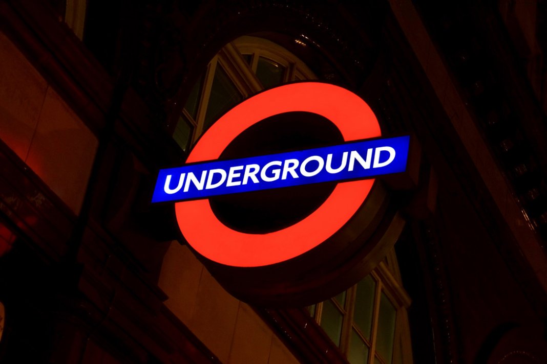
In the maze of London’s underground network, no symbol is more instantly recognizable than the red circle and blue bar of the Transport for London roundel. This deceptively simple design has guided millions of passengers for over a century, evolving from a practical wayfinding solution into one of the world’s most successful transport brand identities. The roundel represents more than mere signage—it embodies London’s commitment to design excellence and public service accessibility.
Birth of a Brand Identity
The story of the roundel begins in 1908 during the early days of London’s underground railway system. As multiple private companies operated different tube lines with varying signage and branding, passengers faced considerable confusion navigating the growing network. The Underground Electric Railways Company of London, seeking to create unified identity across their lines, commissioned a solution that would become one of design history’s most enduring successes.
The original concept emerged from practical necessity. Station signs needed to be visible from moving trains, distinguishable in poor lighting conditions, and recognizable regardless of literacy levels. Early experiments featured solid red circles, but these proved difficult to read when station names were overlaid. The breakthrough came with the addition of a horizontal blue bar across the circle’s center—creating space for clear, legible text while maintaining the distinctive circular motif.
Edward Johnston, the renowned calligrapher and typographer who later created the iconic Johnston typeface for London Transport, refined the design in 1916. His version established the proportions and color specifications that remain largely unchanged today: a red circle with precise dimensions and a blue bar that extends slightly beyond the circle’s edges, creating visual balance and improved readability.
Design Evolution and Standardization
The roundel’s evolution reflects London Transport’s growing sophistication in corporate design and brand management. Initially appearing only on underground stations, the symbol gradually expanded across buses, trams, and other transport services as London’s transport network unified under central management in the 1930s.
Frank Pick, London Transport’s visionary chief executive, recognized the roundel’s potential as more than functional signage. Under his leadership, the symbol became central to a comprehensive design strategy that encompassed everything from vehicle livery to advertising posters. Pick understood that effective public transport required not just efficient service but also clear, attractive visual communication that would encourage public confidence and usage.
The roundel’s standardization process was meticulous. Precise specifications governed color values, proportions, and positioning. The red was carefully calibrated for maximum visibility under artificial lighting, while the blue provided sufficient contrast for legibility. Size variations were developed for different applications—from large station signs to small vehicle decals—but all maintained the essential proportional relationships that made the symbol instantly recognizable.
During World War II, the roundel gained additional significance as London’s underground stations served as air raid shelters. The familiar symbol provided reassurance and orientation for millions of Londoners seeking safety below ground, cementing its association with protection and public service during the city’s darkest hours.
Global Recognition and Influence
The roundel’s success influenced transport design worldwide, inspiring similar circular logos and branding systems across numerous cities. However, few achieved the same level of recognition or emotional connection that London’s version maintains with its users. The symbol’s effectiveness lies not just in its visual appeal but in its consistent application across every aspect of London’s transport network.
International visitors quickly learn to associate the roundel with reliable public transport. The symbol appears on maps, mobile apps, street signs, and vehicle graphics, creating a comprehensive wayfinding system that transcends language barriers. For many tourists, successfully navigating London using the roundel system represents a significant achievement and connection with the city.
The design community has celebrated the roundel as an exemplar of successful corporate identity. Design museums worldwide display London Transport materials featuring the roundel, while graphic design textbooks cite it as proof that simple, well-executed design can achieve both functional and aesthetic excellence.
Modern Applications and Digital Evolution
The digital age has brought new challenges and opportunities for the roundel. Transport for London has successfully adapted the symbol for screen-based applications, mobile apps, and digital displays while maintaining its essential character. The roundel’s geometric simplicity translates effectively to digital formats, appearing crisp and legible at various screen resolutions and sizes.
Contemporary applications extend far beyond traditional transport signage. The roundel appears on merchandise, architectural elements, and even public art installations. Licensed products featuring the symbol generate significant revenue for Transport for London while spreading the brand’s recognition globally. From umbrellas to clothing, the roundel has become a cultural export representing London’s design heritage.
Social media and digital marketing have given the roundel new life as a hashtag symbol and profile icon. London residents and visitors frequently incorporate the roundel into photographs and social media posts, demonstrating its continued relevance in contemporary visual culture.
Cultural Impact and Public Affection
The roundel transcends its transport function to represent London itself in many contexts. The symbol appears in art installations, architectural details, and commercial designs throughout the city. Its circular form and distinctive colors have become shorthand for London’s efficiency, accessibility, and design consciousness.
Public affection for the roundel runs deep among Londoners, who often express genuine fondness for the symbol’s role in their daily lives. Many residents can navigate the city using roundel locations as reference points, demonstrating how successfully the symbol has integrated into London’s urban geography and collective consciousness.
The roundel’s democratic character—equally visible and meaningful to all transport users regardless of background—embodies London’s commitment to accessible public services. Unlike many corporate logos that primarily serve marketing purposes, the roundel genuinely helps people navigate their city more effectively.
Design Legacy and Continuing Relevance
Today’s roundel maintains remarkable consistency with Edward Johnston’s 1916 refinements, testament to the original design’s fundamental strength. While colors have been adjusted for modern printing and digital applications, the essential proportions and relationship between circle and bar remain unchanged.
The symbol continues to influence contemporary design thinking about public service branding and wayfinding systems. Urban planners and transport authorities worldwide study London’s roundel system as a model for creating coherent, user-friendly navigation systems that serve diverse populations effectively.
Enduring Connection
The Tube roundel represents more than a century of design evolution and public service excellence. Its success lies not in complexity but in simplicity—a red circle and blue bar that somehow captures London’s spirit of innovation, accessibility, and civic pride. For millions of daily users and countless visitors, the roundel provides not just direction but connection to London’s rich transport heritage and continuing commitment to serving its diverse, dynamic population.
In an age of rapid technological change, the roundel stands as proof that exceptional design transcends trends and technology, remaining relevant and beloved across generations of Londoners who depend on it to navigate their remarkable city.
A Little Bit of London In Your Inbox Weekly. Sign-up for our free weekly London newsletter. Sent every Friday with the latest news from London!


